Activ4 - Repositioning a School Tour Operator for Future Growth
A complete repositioning of Activ4’s digital presence, combining brand evolution, UX strategy and a scalable WordPress platform to support the company’s continued growth across sports, ski and educational travel.
Activ4 is a specialist school tour operator offering sports, ski, educational, adventure and performing arts trips. What sets the company apart is its team of former teachers, whose classroom experience shapes every stage of the planning process, from educational value and safety to the practical realities of leading school groups abroad. As the business continued to grow, the challenge was ensuring its brand and digital experience reflected that expertise.
The result is a scalable digital platform that better reflects Activ4’s expertise, supports future growth and gives teachers a clearer path from inspiration to enquiry.
Client testimonial
“We’ve worked with Siân for well over a decade and she has become a trusted extension of our business. She challenged our thinking, brought fresh ideas to the table, and translated our vision into a modern, professional identity that genuinely reflects our business. What sets Siân apart is that she doesn’t simply build websites – she takes the time to understand the business behind them.“
– Steve Scott
Managing Director, Activ4 School Tours
Project summary
Project Scope
Brand evolution
UX strategy
Information architecture
Content strategy
WordPress design & development
SEO architecture
Tour taxonomy
Blog strategy
Conversion optimisation
The challenge
Activ4 had grown significantly over the years, expanding from sports tours into ski trips, educational travel, adventure experiences and performing arts. While the business had evolved, its digital presence hadn’t kept pace.
The website had become increasingly difficult to navigate, content had grown organically without a clear structure, and the visual identity still reflected the company’s early years. An ageing logo and inconsistent branding no longer represented the quality, professionalism and ambition of the business.
The challenge wasn’t simply to redesign a website. It was to modernise the brand, rethink how complex information was organised, and create a scalable digital platform that could support Activ4’s continued growth.
The approach
The project began with strategy rather than design.
Working closely with the Activ4 team, I restructured the site’s information architecture around the way teachers actually search for school tours, creating a flexible taxonomy capable of supporting hundreds of destinations, subjects and tour types.
Alongside the UX and content strategy, I refreshed the visual identity. Rather than replacing the brand entirely, I evolved it –refining the logo, typography and colour palette to create a more confident, contemporary identity while retaining the recognition the business had already built.
The result is a brand and website that feel aligned: clearer, more professional and designed to grow with the business.
The structural problem
The complexity wasn’t visual – it was structural.
The website needed to accommodate:
- five distinct product ranges
- hundreds of destinations
- multiple sports
- curriculum subjects
- ski countries and resorts
- shared destinations appearing under different trip types
- large volumes of future content
Teachers also approached trips differently depending on what they were planning. Some searched by destination, others by curriculum subject, sport or activity. The structure needed to support all of these journeys without becoming confusing.
The solution
Instead of treating the website as a collection of pages, I redesigned it as a structured content system.
A new taxonomy was developed that allows tours to be organised by:
- subject
- destination
- sport
- ski resort
- country
- activity
This created a scalable framework capable of supporting hundreds of future tours while generating logical landing pages and SEO-friendly URL structures.
Alongside this, I:
- I rewrote the key brand pages, clarifying Activ4’s proposition and helping build trust before users began exploring individual tours
- expanded tour content to include excursion and highlight content
- created consistent page templates
- designed new filtering and navigation
- improved enquiry journeys
- refined the visual identity
- introduced a clearer content hierarchy throughout the site
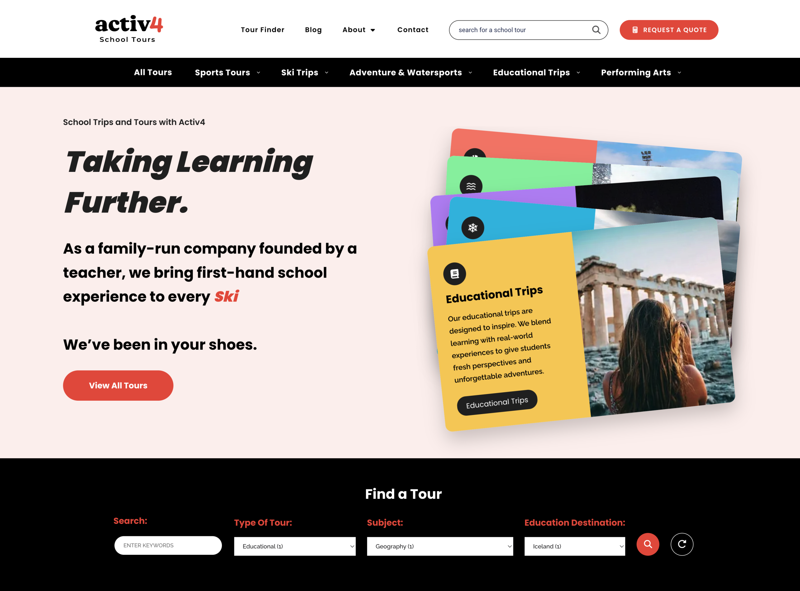
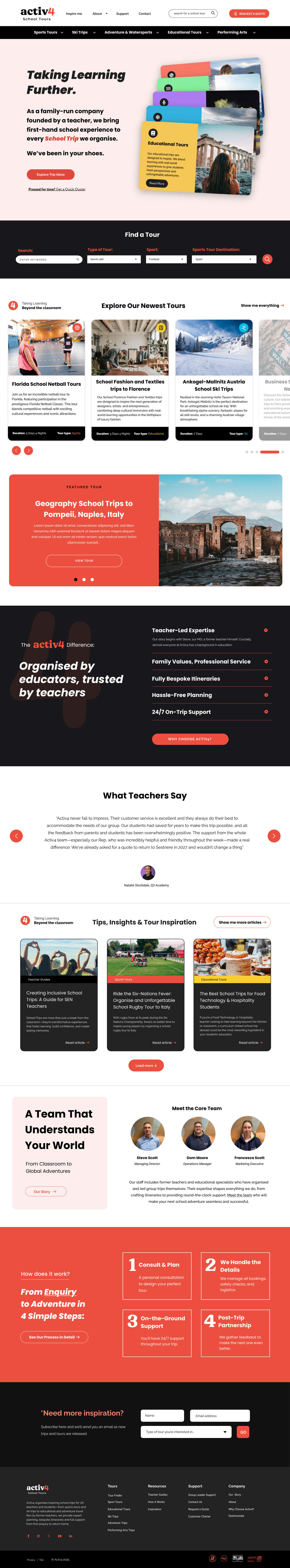
The New Digital Platform
The redesigned platform combines improved information architecture, a refreshed visual identity and purpose-built page templates to support every stage of the decision-making process – from introducing the Activ4 story and building trust to helping teachers discover, evaluate and enquire about the right school trip.
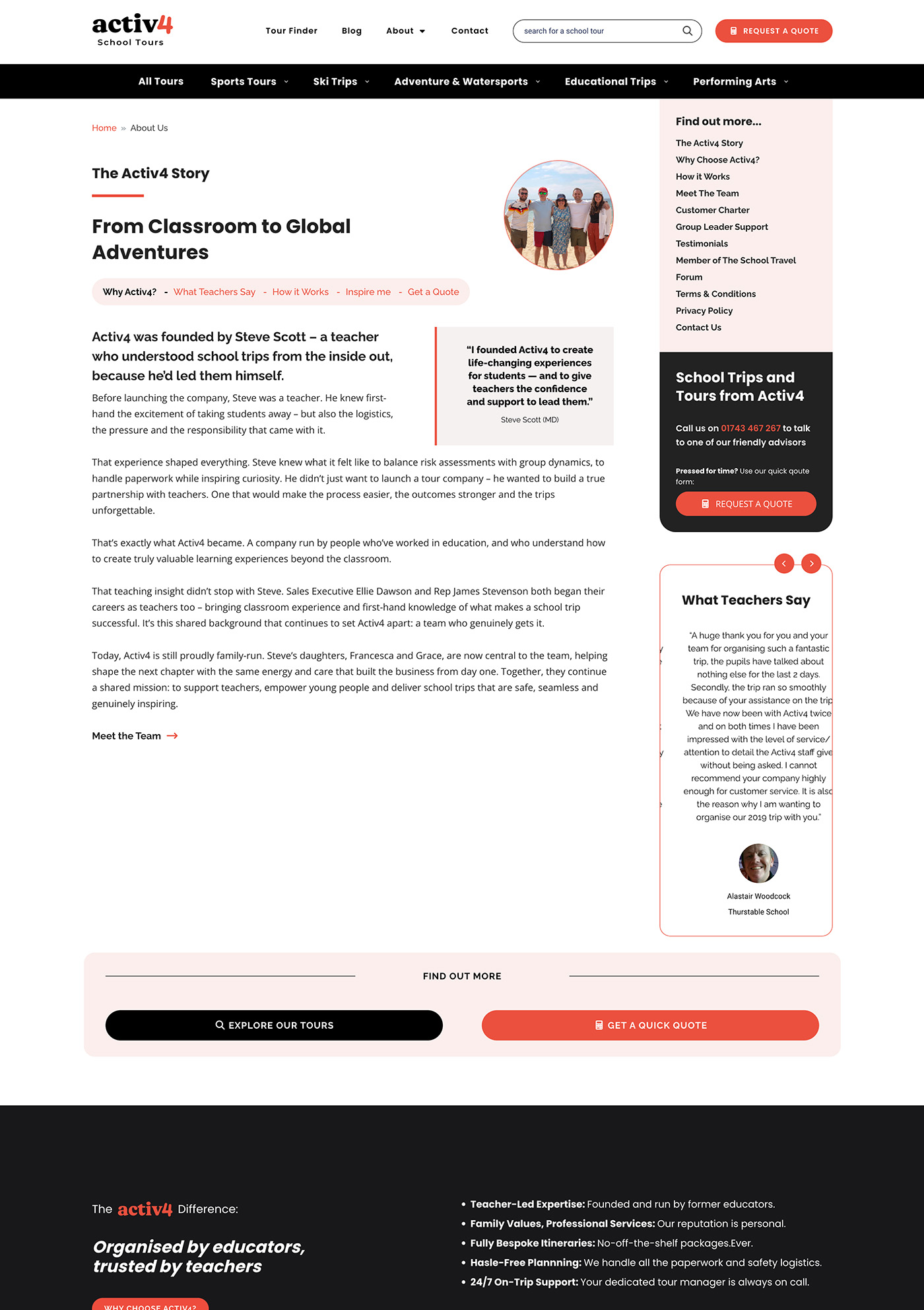
The Activ4 Story
Telling the Activ4 story – from the company’s classroom roots to the trusted school tour operator it is today.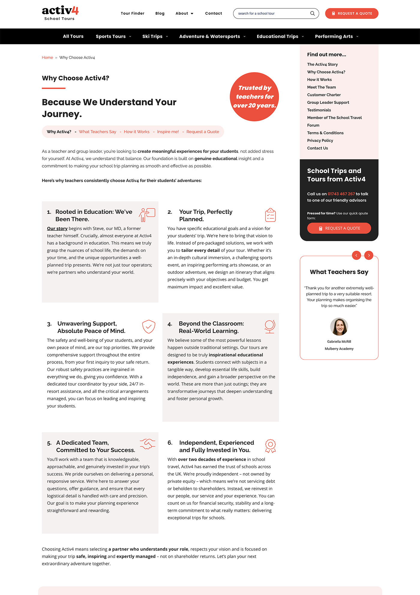
Why Choose Activ4
Explaining Activ4’s unique position as a school tour operator founded and run by former teachers.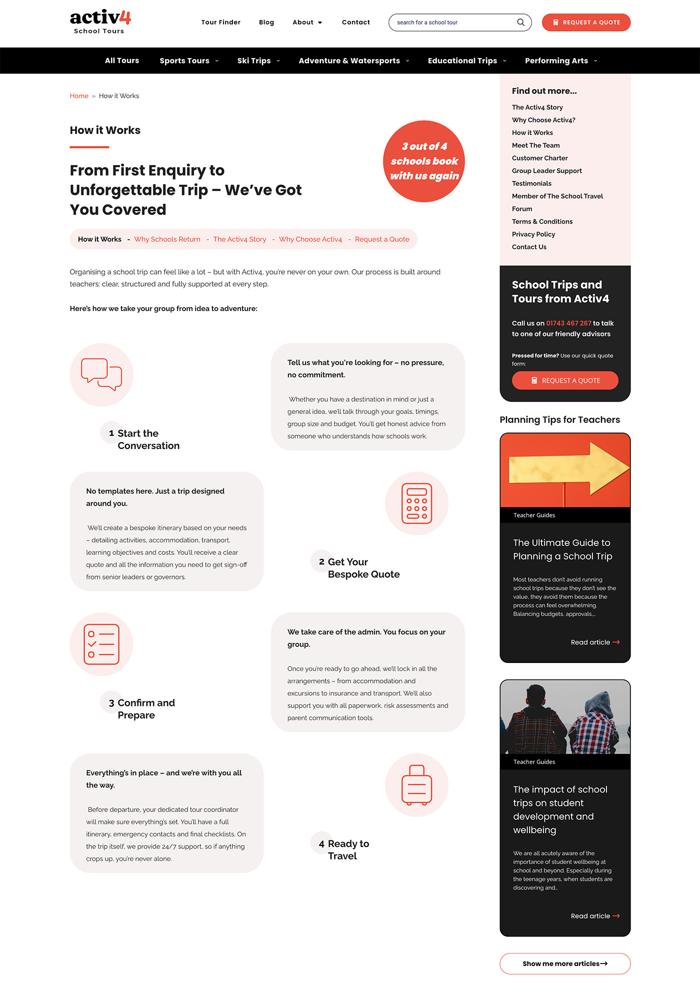
How It Works
A dedicated journey explaining the enquiry process and building confidence at every stage.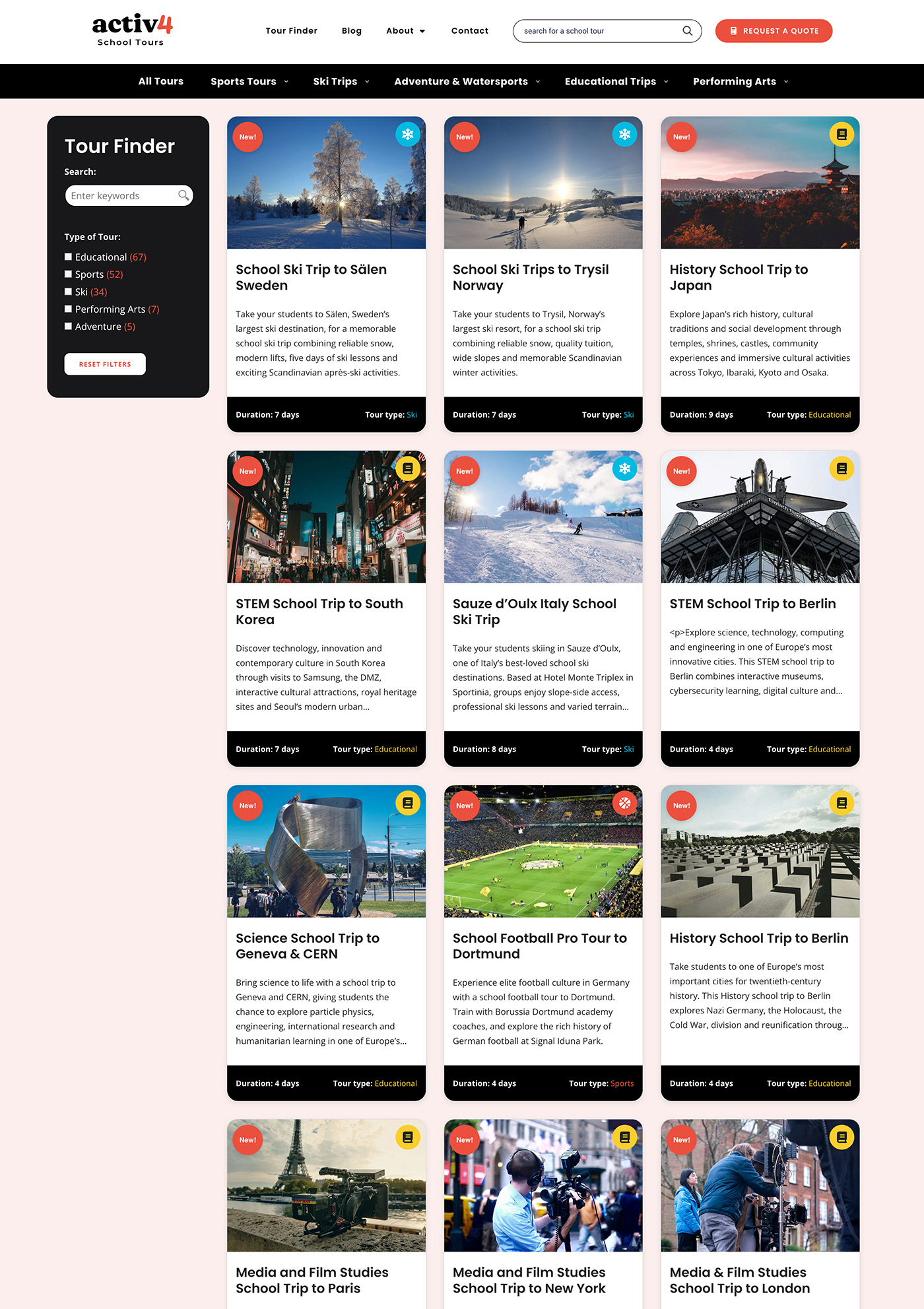
Tour Finder
A flexible tour finder, allowing teachers to browse and filter hundreds of trips by subject, destination and activity.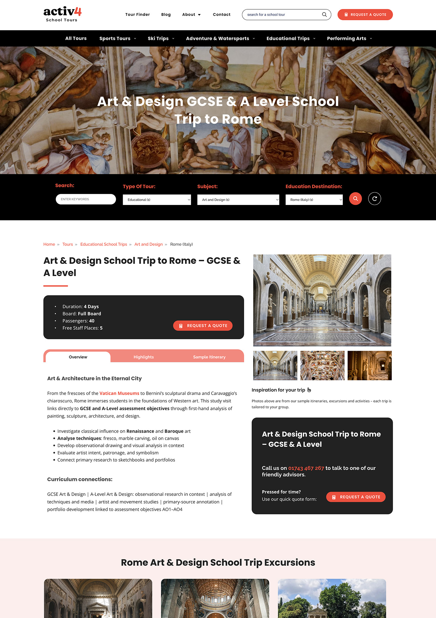
Tour Page
A richer tour template combining inspiring content, practical information and clear calls to action.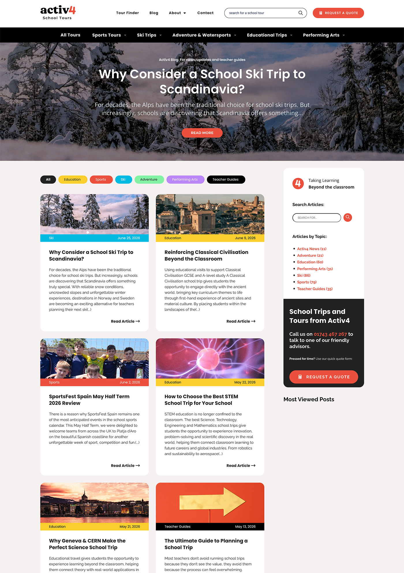
Blog & Resources
A knowledge hub designed to support teachers with destination guides, planning advice and educational inspiration.Activ4's new Logo and Brand Refresh
Concept & Thought Process
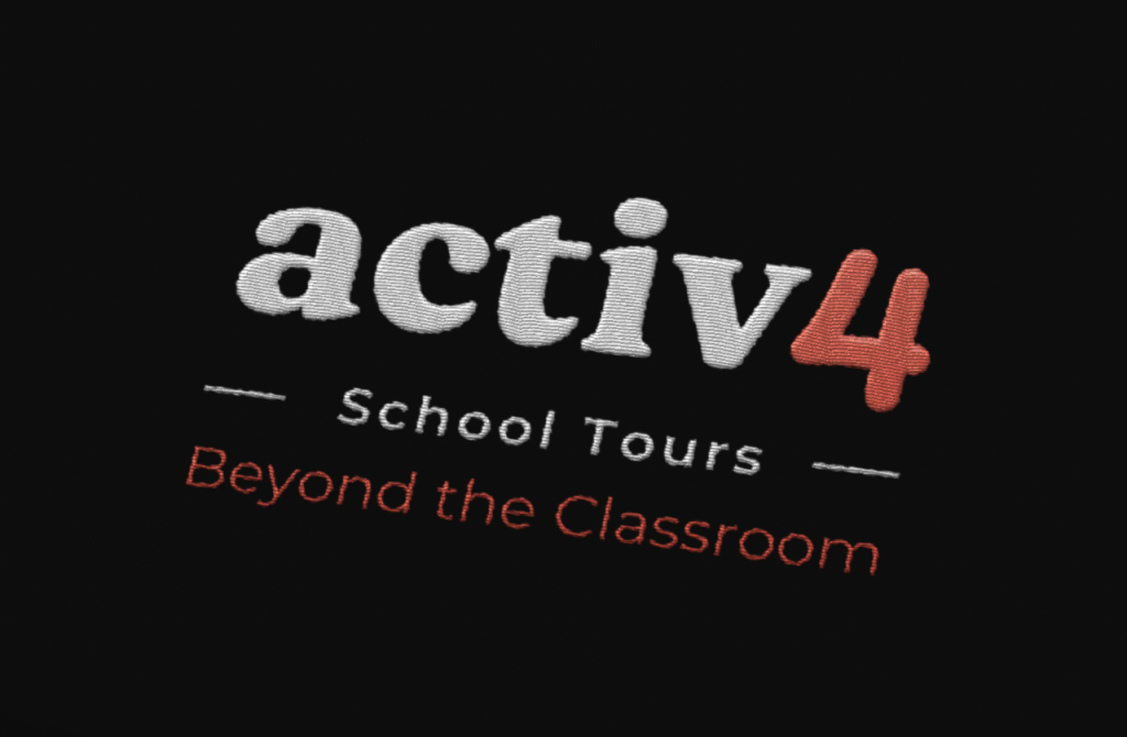
The objective wasn’t to reinvent the Activ4 brand, but to evolve it in a way that felt more contemporary while preserving the familiarity that existing customers recognised.
The refreshed identity combines a bold, slab serif wordmark with a modern interpretation of Activ4’s distinctive handwritten “4”. The lowercase activ retains an approachable, informal feel, while the refined numeral pays homage to the original hand-drawn character through its softer, rounded form. Together they create a balance between professionalism and personality.
The logo was designed as a flexible system rather than a single mark. Alongside the primary lock-up, the standalone activ4 wordmark works confidently across digital applications, while the descriptor and tagline can be introduced where additional context is required.
Logo Execution
Typography: A bold slab serif wordmark communicates confidence, reliability and authority, while the lowercase styling keeps the brand approachable and human.
Mark: The updated “4” retains the spirit of the original handwritten symbol, redrawn as a cleaner, more consistent form that scales effectively across digital and print.
Colour palette: The refreshed coral accent introduces warmth and energy, contrasting with the strong monochrome wordmark to create a modern, recognisable identity.
Final Result
The new identity respects Activ4’s heritage while presenting the company as a more confident, professional and contemporary brand. By evolving rather than replacing the existing logo, the redesign strengthens brand recognition while providing a flexible identity system capable of supporting the business across web, print and future marketing materials.
Activ4's new Logo and Brand Refresh
Final logo (light version)
Activ4 logo – proportions
The full lock-up
Real-world use case: The refreshed identity applied to tour representative clothing.
The “4” as a recognisable graphic device throughout the website.
A wordmark for everyday digital applications in a new brand colour palette